

Harry Potter Month is hosted by Faith at Geeky Zoo Girl and Micheline at Lunar Rainbows Reviews. This fun event runs throughout the month of July. Find out more about it here.
In Part 1 of The Magic of the Harry Potter Covers, I broke down the covers to find things hidden in the art. I'll be doing the same here with covers 4-7, but starting with number 5 the covers are much plainer. It's like the covers are growing up alongside Harry just like the story is. They later covers do not have all of the fun hidden objects, but I think there's definitely some interesting hidden meaning to discuss. It's so exciting!
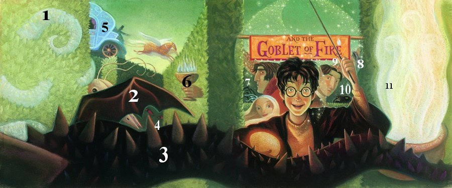
1. MONSTER!
2. ANOTHER MONSTER
3. DRAGON
4. Could be another monster, but I think it's Voldemort because the eyes match the ones on the 7th cover.
5. Beauxbaton's carriage
6.*EDIT* Triwizard Cup that was the portkey to the graveyard (Thanks Alex!)
7. Spider and a Blast-Ended Skrewt
8. There's no demeters in GoF, so I'm guessing this is a Boggart
9. Crowd of people to watch the Tounament
10. Sirius, or should I say Snuffles
11. Very impressive looking Goblet of Fire
*Very much in the style of the previous covers. I think there might be even more to find in this one than any other book cover.

1. THERE'S A SNAKE IN THE SMOKE!
2. Sirius at Grimmauld Place or the Department of Mysteries?
3. Who is the shadow?
4. The Department of Mysteries
5. Mad-eye, Tonks, and Remus coming to get Harry at Privet Drive
*There's a dream-like quality in the smokiness of the cover. I also love that it shows us scenes from two (maybe three) places: Harry at the Department of Mysteries (or at least his dreams), the Order coming to get him at Privet Drive, and possibly Sirius standing in a door way. There also seems to be a general theme of doorways.

1. Dark Mark
2. Ron, Hermione, and Ginny
3. Hogwarts
4. The Pensive
*In general, the cover looks very cloudy (kind of like the 5th). Maybe the entire book itself is a Pensive showing us a memory.

1. Voldemort... I added him to the list because for some reason I always thought he was a dementor
2. Broken bits of Hogwarts
3. The crowd standing around watching shows that this is probably the last battle between Harry and Voldemort
4. You can barely see it, but Harry's wearing the pouch Hagrid gave him for his Birthday. The one he used to carry the Snitch, part of Lily's letter, his broken wand, etc.
5. Neither of them are holding a wand, maybe because they're reaching for the Elder Wand after Voldemort was disarmed?
6. Books 1 and 7 are the only ones to use the curtains on the edge of the cover. Maybe they "open at the close"
Do you prefer the art of the earlier covers or the later ones? Did you notice anything I missed?
I think I prefer the first batch of the book covers. They are more magical and interesting to explore. I agree that the next batch, especially starting with book 5, became more straightforward and simple and less inhabited by hidden clues and extra details. I suppose they had to grow - after all, the books have. But in doing so they did lose a certain sense of magic...
ReplyDeleteI think the hidden details of the earlier covers show the series as being for children while the later covers definitely show how much Harry, and the readers, have grown up. But I do love the magic of the earlier covers. They seem to inhabit the Wizarding World more.
DeleteI love, love, LOVE the last 3 covers of the series ♥ As much as I adore the earlier ones, my heart always calls out to me when I see OotP but especially HBP and DH! Though I do like that there are more hidden details in the earlier covers...Gah! I love them all, I can't decide LOL XD
ReplyDeleteI like the later covers also because Harry looks less cartoonish and more... awesome. What they lack in hidden details they make up for in mysteriousness. I think covers 3, 5, and 7 are probably my favorites.
DeleteI'm kind of torn between the earlier covers and the newer ones. The cover of PoA is one of my favorites, but I also love the covers for OotP and DH. I always wondered about the way Harry's was positioned on the cover of DH, but that makes total sense that he and Voldemort may both be reaching for the Elder Wand!
ReplyDeleteThose are my favorite covers as well!
DeleteOooh I haven't noticed that at all about the curtain. Order of the Phoenix always seemed the prettiest to me of these. Something about the blue really dragged me in, but then that book was the first one to seem so incredibly sad for Harry. I don't think much went right for him that year. I love these covers. They are the ones that I have. There are a bunch of new ones though that I would also LOVE to have as well.
ReplyDeleteOh yeah, I always want more editions. The ones that I want most right now are the Scholastic Special Editions which I think are beautiful. Maybe if I call myself a HP collector I won't feel so guilty buying them.lol
DeleteFor the Goblet of Fire, maybe the smaller cup is supposed to be the portkey to the graveyard. What a sneaky thing to put on the cover of the book! AND the curtains on the first and final books, goodness. I wonder if J.K. Rowling specified that, or maybe it was just a nice coincidence. What a beautiful little touch.
ReplyDeleteThe transition of the covers from the concrete items on the covers to the dreamlike, hazy smoky covers where you can't really distinguish much is a great visual for the series itself. We start off knowing very basic things. Harry is a wizard, Voldemort tried to kill him and he survived. And then later beginning really in Order of the Phoenix, a little in Goblet of Fire everything becomes more convoluted. People start questioning Harry's validity, they don't believe that Voldemort has returned. They've willingly put a figurative cloud of smoke around themselves, shall we say, clouding their judgement. It isn't until the Deathly Hallows, when Harry [Read: mostly Hermione and Ron helped too] figures out how to stop Voldemort for good, that things become more concrete again. The covers are a cool reflection of the story that's inside them.
THAT MAKES SENSE! That 2nd cup just didn't seem right until now.
DeleteI absolutely love your interpretation of that later covers! The magic in the later book covers are more abstract instead of the solidness of the hidden objects in the early covers, and your interpretation shows the reasons for it. Wonderful!
You're right about the covers kind of 'growing up' with Harry, I think. I didn't notice it before, but Order of the Phoenix's smoky cover IS very dream-like, so it's incredibly appropriate. While it doesn't have as many fun hidden tidbits, I think it's still got very interesting and thought-provoking detail, bringing to mind Harry's many dreams and their uncertain meanings throughout the book.
ReplyDelete(I had to skip the last two, since I haven't finished them yet!)